Compendium for mapping group dynamics
The Compendium design team has always envisaged the tool as analogous to spreadsheets for ideas: “Excel for Knowledge” if you will. Instead of handy tools for working with numbers, the vision is for an intuitive tool providing scaffolding for rendering, linking, structuring, categorising and debating ideas, with a customisable user experience, without knowing in advance what the domain of application will be.
We know that as a research prototype which has evolved through serial research funding, Compendium is still a bit of a power tool, lacking the ‘walk up and use’ polish that other products have. However, the spreadsheet metaphor is holding up well for an experienced user, if my latest project is anything to go by.
I’ve recently started some really stimulating work with psychotherapists, who are expected to provide evidence that patient outcomes are tied to their participation in therapeutic groups. We’ve been using Compendium to convert their usual notes from analytic group sessions, into maps that reflect key aspects of the group dynamics. From an information visualization perspective, the goal is to relieve individual memory load, filter complexity, provide shared reference points, and make visible potentially significant patterns.
We could do that in any drawing package, of course, but Compendium has a full database behind it: nodes and links are hypertext elements, not just dumb graphical objects. Compendium’s ability to design and assign combinations of tags (keywords, equivalent to qualitative data analysis codes), coupled with node embedding (rendering a given node in the network in multiple views), offers the prospect of conducting longitudinal comparative analyses across sessions, at both the individual and group levels.
I comment below (from the perspective of Compendium technique so that you can do this for yourself) on some of the slides for our presentation to the Society for Psychotherapy Research annual conference later this month (abstract at the end).
Template:
This is slide shows the results of importing a group session Template Map (ie. an exported XML file). This is brought in either via the Tools/Templates menu, or from the Stencil we created. This pre-populates the map with a background graphic for the group circle, and Reference nodes with custom icons for each group participant, using colour to show gender at a glance. The analyst moves the icons to reflect seating positions, which is important to record. When imported, the predefined node label has the patient’s name and an empty [ ]. The analyst enters the session number in the brackets (e.g. [1]). Each node is tagged with their name, so that when clicking on their name to filter the database via the Tags Sidebar, we can rapidly see all Views in which that patient appears: a session list is retrieved with name [1], name [2], etc. The analyst makes the name labels for absent patients grey, and adds a note as to why, in the label or detail.
Over this template:
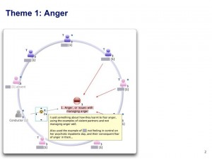
The slide shows the analyst’s mapping of the first theme that emerged, indicating the patients involved. Red links and a Con node are selected to reflect the theme of anger. Details of each patient’s contributions are entered in the Detail for their node. Where the conductor (i.e. analyst) made an intervention in the group, this is shown with links from the conductor node, with a Small Icon node laid over the link with explanatory notes in the detail, accessible on mouse rollover as shown.
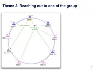
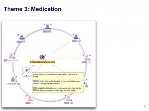
Each node is shown as being embedded in three maps (“3” digit to lower right of icons). This is because the nodes sit in three maps, each one showing a different theme, as shown in the next two slides. Each time I made a new view, the embed number goes up:
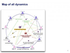
Together, the map of all dynamics is as shown below. The importance of using colour to differentiate different themes is clear: it would be illegible without the colour cues:
Link weight is used to show particularly strong interpersonal relationships (we are using an alpha release of the new version 2.0).
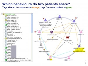
The final slide shows how the growing database can be filtered and interrogated via the Tags Sidebar. A set of tags evolved to capture important classes of behaviour that the analysts want to track. A new tag can be created at any point. They are all dragged and dropped into a Tag Group, which is then made into the Default Tag Group (turning it green), so that it also appears in the Tag Menu in the Tags Toolbar, making them accessible from any map without opening up the tag sidebar, if screen space is limited.
Selecting any node highlights in orange the relevant tags. Selecting two or more nodes highlights in orange tags shared in common, and other tags in green.
Next steps
As we populate Compendium with more data, what we hope to explore in the next phase are additional ways of evidencing changes, in individuals and the group, across sessions.
We envisage a number of ways in which the tool could support this, including:
Group level:
- Compare the maps from two or more sessions by embedding them next to each other in a comparison map, enabling annotation with comparative notes.
- Compare the group tag profiles from sessions, i.e. by selecting all nodes in a map, all relevant tags ‘light up’. We would hope to see a shift from negative to more positive tags over time.
Individual level:
- Compare the tag profile for a patient over time, from pre-group assessment, through early, midway and closing sessions, to review.
- Compare relationships between specific patients across sessions.
- Look for patterns of co-occurring tags or shifts in tag profile which might be predicted on theoretical grounds, or which are seen as emerging from the data.
- Reflect on the nature and impact of the conductor’s interventions (which could be tracked more systematically by devising a set of conductor-specific tags, should that become a focus of research/reflective practice – tags are currently solely about patient behaviour).
One untested Compendium v2.0 feature that may also be useful is the facility to animate maps (rather like building a slide gradually with animated elements), which could help in the presentation of complex maps. A second feature is video annotation: should there be video footage from groups, this can be annotated directly with nodes and links. We report elsewhere on the use of this for choreographic research and education, the context in which this new feature was developed.
In conclusion, from the perspective of our Hypermedia Discourse research, what we are seeking to demonstrate here is the contribution of visual, semantic hypermedia to collective sensemaking: providing a flexible “spreadsheet for ideas” that enables the recording of behaviour, overlaid with analysts’ interpretations (possibly from many analysts with different perspectives, should that be required), providing an evidence base. In principle, this provides new ways for researchers, practitioners and educators to make group processes visible, inspectable and analysable.
Abstract
Brown, M., Downie, A., Howard, N. and Buckingham Shum, S. (2010). Compendium: A computerised programme for the tracking and measurement of group process. 23rd Meeting of the Society for Psychotherapy Research, Ravenscar UK [www.psychotherapyresearch.org/cde.cfm?event=273111]
Group analysis is a form of psychodynamic psychotherapy, and as such tends to lag behind cognitive behavioural therapy and other similar treatment approaches in terms of evidence based practice. In these therapies we believe that it is the process that enables change to take place. This is harder to measure or describe and usually relies on therapists hand written notes and memory. Small wonder, then that most research focuses on outcomes alone rather seeking to identify the processes by which change came about.
We are working with a computer based programme called Compendium developed by the Open University as a means of recording and analysing dialogue; its uses include web diagrams and critical pathways at work. We anticipate it will identify more clearly the process whereby individual and group change comes about, complementing measures such as CORE.
We hope to demonstrate that compendium provides an effective means of extrapolating relevant data in terms of group process in a visual form enabling easier recognition of significant patterns of discourse and points of change in individual members and the group as a whole.
Congratulations. I’d like to use and to adapt the template. Could you tell me if it is possible to get it?
Thanks for your work
Hi Paco,
Yes, email me and I’ll send you the XML file.
Simon
UPDATE:
This work has subsequently been published:
Marion Brown, Andrew Downie, and Simon Buckingham Shum (2012). Mapping the Matrix: Using Compendium as a Tool for Recording the Analytic Group. Group Analysis, 45, (1), pp. 99-115. DOI: http://dx.doi.org/10.1177/0533316411430453 Eprint: http://oro.open.ac.uk/33148
The GA sample project data to get you started with this application of Compendium is in this zipped archive:
http://dl.dropbox.com/u/15264330/GA-Compendium/GA-Compendium-March2011.zip
This guide explains how to import it into Compendium:
http://dl.dropbox.com/u/15264330/GA-Compendium/GA-Compendium-Project.v0.3.doc
This guide is to creating a new GA template once you have set up your group:
http://dl.dropbox.com/u/15264330/GA-Compendium/GA-Compendium%20New%20Group%20Template.doc
Simon
May 12th, 2012 at 7:59 am
[…] with group dynamics colleagues, using Compendium, our most mature knowledge cartography tool, to map the dynamics they were seeing as therapists. Delighted to say that an article we wrote up has now come out in […]